
CONSUMER ELECTRONIC
OPERATING SYSTEM
OPPO
The conceptual ideas for the Oppo.
Key visuals and developed visual language aligned with the brand strategy. Design concept of Oppo OS XIV.
Oppo operating system concept is designed to run applications in an optimized manner,
to provide users with productivity-enhancing features and to make the overall experience more enjoyable.
“Oppolence” brand identity film directed by Studio Lernert & Sander.
DESIGN PROCESS
Ideating, Information Architecture, Wireframes + Interaction Design,
– Key Visuals, Design System
Designed Nance end-to-end — a single app for money management,
crypto, travel perks, and investments, all from one place.
Role & scope
I led the end-to-end design of Nance across all 14 phases — from initial business requirements and user research through information architecture, interaction design, visual design, and a complete design system. The project covered three distinct financial domains: everyday money management, cryptocurrency, and investments with travel perks. The goal was to design a single, coherent product that made each domain feel native — not bolted on — while maintaining trust across all of them.
A disruptor in the financial services industry, Payz offers customers a smart alternative to existing banks and money transfer companies. Regulated by the FCA, Payz provides instant, safe and convenient payment services to customers and businesses across the globe. With Payz physical and virtual cards, customers can send and receive money worldwide in over 50 currencies and make payments almost anywhere. Pentagram was tasked with creating a brand identity for Payz that would help it achieve its ambition to become a full-service digital bank that raises the bar in a crowded financial market. The new identity needed to demonstrate that Payz is trustworthy, straightforward and, above all, human; prioritising the needs of its customers while exceeding what both traditional and digital banks offer. The Payz logo sits at the heart of the new identity. Its bold black wordmark, paired with an oversized acid yellow full stop, inspires confidence and signals clarity and intent. The black, white and yellow colour palette runs consistently through the identity system, supported by a neutral kraft tone inspired by simple, everyday natural materials, to contrast with the over-techy brand languages which dominate the digital world. It is used across backgrounds to add warmth and tactile, inspired by the world of daily delivery boxes which bring basic solutions to people's needs. The yellow works as punctuation to highlight and bring confidence of a brand that is straightforward and to the point. The custom Payz typeface is based on Commercial Type's Graphik and is used in two weights, Bold and Regular. Bold, friendly, open and practical. It features an additional oversized full stop glyph that becomes a distinctive brand device, appearing across all touchpoints. The tone of voice is informal, to the point and jargon-free, with punchy straplines brought to life through bold typography and punctuated by the signature yellow full stop. Imagery is casual, quirky, bold and colourful, reinforcing Payz's human approach. The website and app seamlessly extend this system, sharing the same confident, customer-focused design language. Pentagram has created a cut-through, highly recognisable identity system that positions Payz as a credible challenger brand that's the complete antithesis to the old fashioned, bureaucratic banking systems. By combining bold typography, a distinctive colour palette and a direct tone of voice, the new brand elevates Payz from a payment provider to an ambitious digital bank that's simple to use, globally connected and built around real customers' needs.
KEY INSIGHTS
Normal has been redefined and the epidemic has changed our world and our thinking.
Numbness.
During 2020~2022, users are experiencing multiple emotional states at the same time in the face of a fickle world. And the new crown epidemic is just the tip of the iceberg of emotional overload; racial inequality, political polarization, climate crisis and other global issues are also controlling our emotions on a daily basis.
Anxiety.
From work anxiety to long hours working from home, 2020~2022 brings a collective trauma that presents a recessionary mentality that will take years for people to fully embrace.
Weak Time Perception.
The concept of time no longer seems to exist, and the uncertainty created by the new crown epidemic has changed our grip on time, leading to worse health, poorer moods, drowsiness and fatigue.

Olly. Using specific wavelengths of light and changing according to the time of day, it helps users naturally wake up and maintain a healthy circadian rhythm. Natural light LEDs can suppress melatonin and have a similar effect to a cup of coffee.


Rainbow Church – The liberation of light
The changing color of light throughout the day is an important cue for people to perceive time. Hiroshi Sugimoto uses a prism to analyze and record the light at different times of the day, creating photographic installation art.

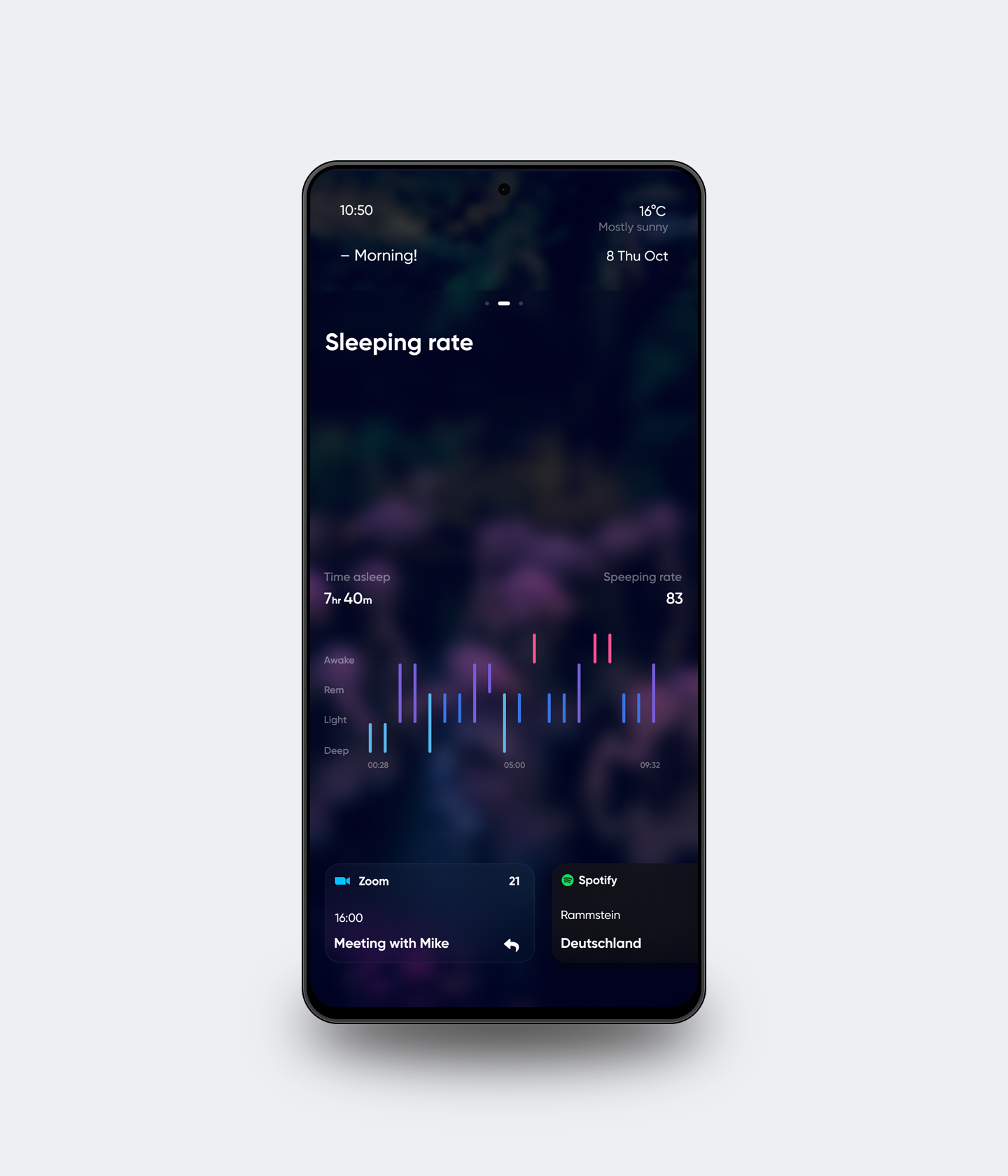
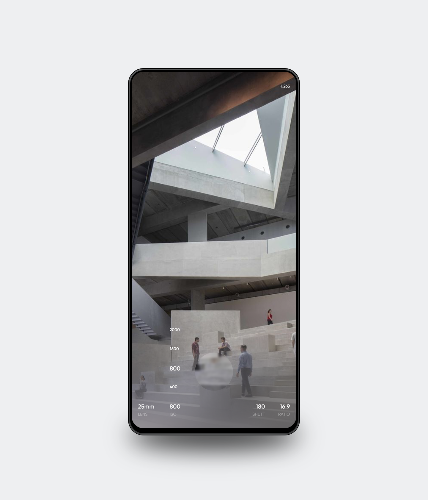
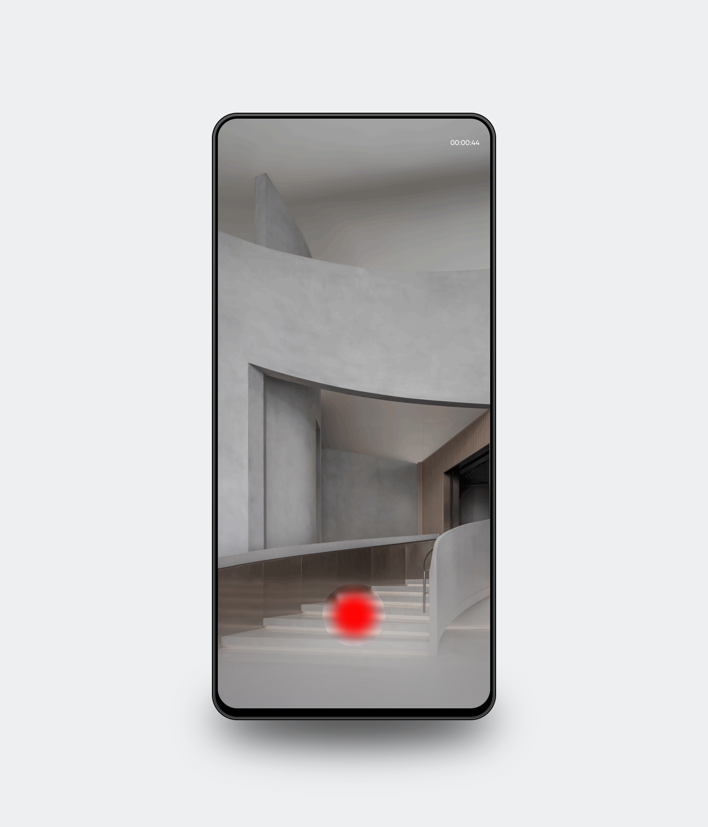
Oppo Gallery.The best way to manage pictures on your phone.
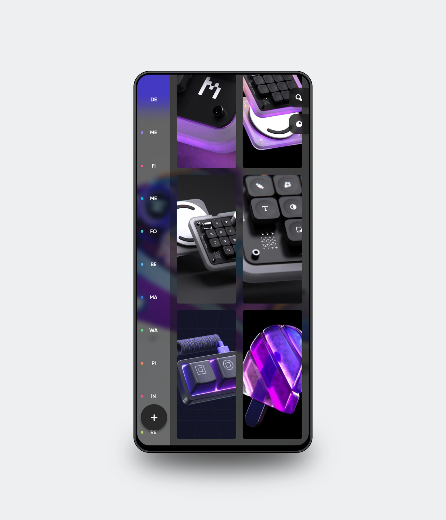


Fluid design.Time is flowing, fluid gradient design can well show the subtle changes of time
in a static interface, fitting the law of nature.


Get in touch
— ivan@stoilovskikh.com