
INTERACTION DESIGN
UTILITIES
SCREENA
Next step in the evolution of mobile galleries.
There is always a mess in the photo gallery on the device. A mess of random pictures:
pizzeria menu pictures, shots of your inner Timothy Hogan, screenshots, memes, and ofc selfies.
So there is a way to deal with it and pretend that you are a mindful and responsible user of the gallery.

iOS photo library.
Organised by how
you remember,
not when you shot.
FRAMING
The default gallery is a log, not a library.
Chronological order is a technical default, not a design decision. It reflects how storage works, not how retrieval works. People don't remember when they took a photo — they remember what it was of, where they were, or how it felt.
The question wasn't how to make a better gallery. It was whether a gallery organised around associative memory instead of timestamps could actually hold together as a product.
CONSTRAINTS
Scope is a design tool.
PLATFORM
iOS only
Not a cross-platform decision — a depth decision. Designing for one OS meant the gestures, permissions model, and photo library API could be treated as given, not designed around.
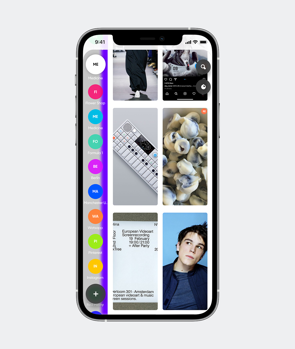
ORGANISATION
Manual, always
Auto-categorisation was tested and dropped. It removed the act of sorting, which turned out to be the mechanism that makes retrieval stick. You remember where you put something because you put it there.
BUSINESS MODEL
Free, no upsells
Removing monetisation from the equation kept every interaction question clean. No feature needed to justify itself against a conversion funnel. Useful as a constraint even if unsustainable long-term.
PROCESS
Prototype the core mechanic before anything else.
The drag-and-drop sorting interaction was built and tested in isolation before any screen was designed. The hypothesis was that direct manipulation — physically placing a photo into an album while seeing the album — would create spatial memory that made retrieval faster. It did.
Testing was done with frequent travellers — people with large, disorganised libraries and a clear retrieval problem. They picked up the sorting gesture without instruction. That was the green light.
KEY DECISIONS
Four interactions, each resolving a specific tension.
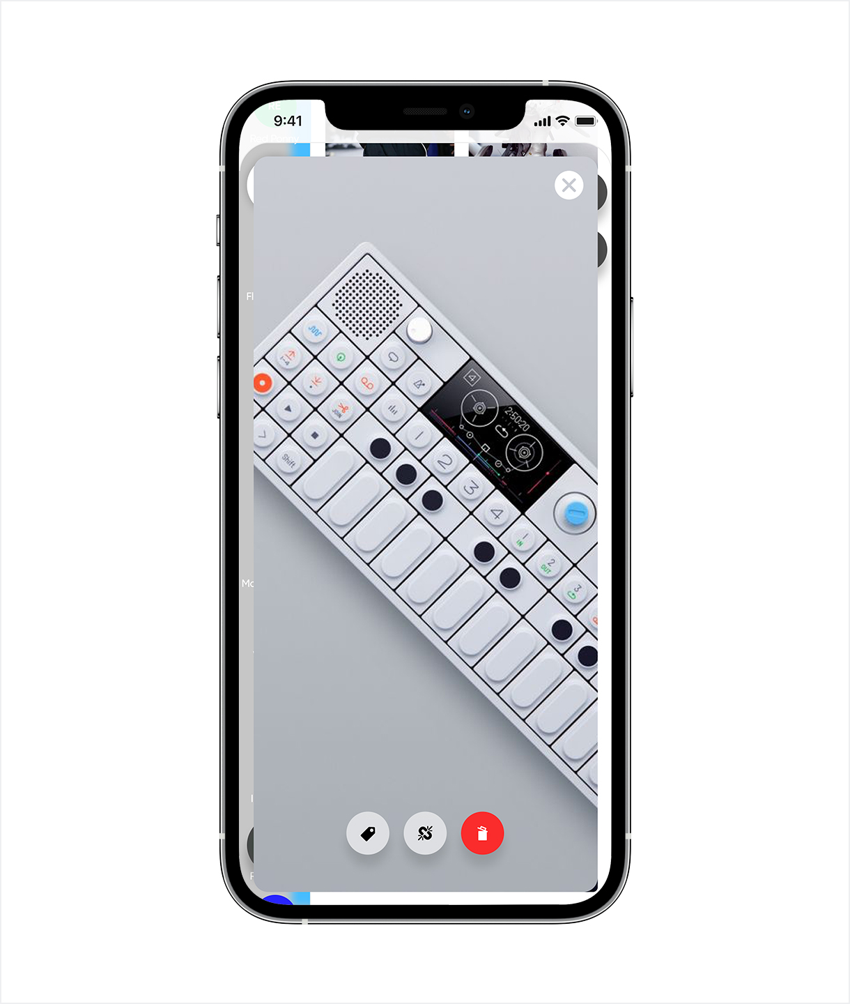
Post-capture tagging
optional, immediate
Context is highest right after capture. It degrades fast.
A light overlay appears after each shot — skippable in one tap. The friction of tagging later is higher than the friction of a dismissible prompt. Making it optional was the only way to keep it from feeling like a tax.
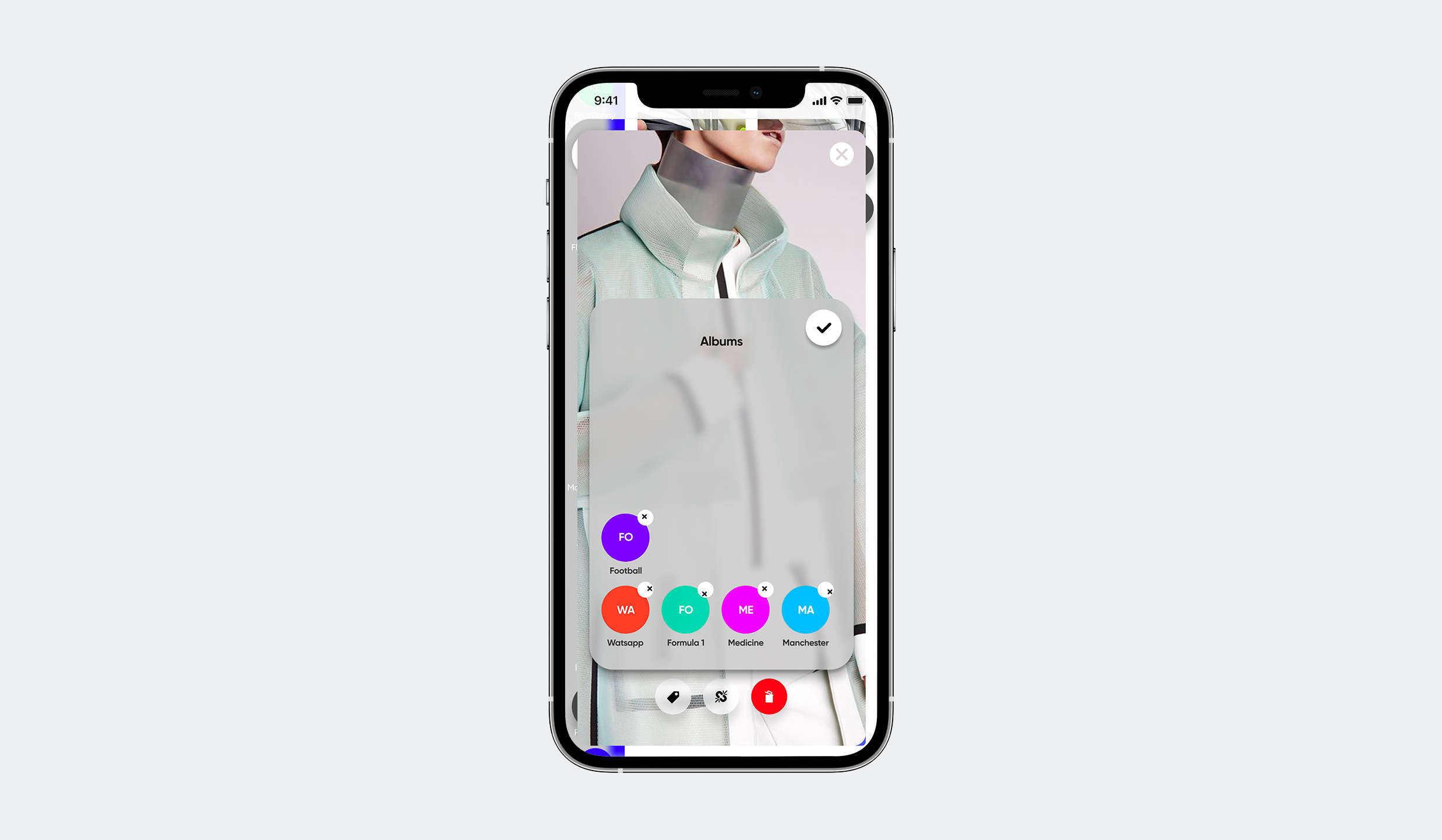
Multi-album membership
no forced hierarchy
Memory doesn't use folders. A photo doesn't belong to one thing.
A single photo can live in Architecture, Paris, and 2023 simultaneously — without duplication. The data model needed to support this from the start. Retrofitting it would have broken the sorting interaction.
Drag-and-drop sorting
albums visible mid-drag
The physical act of placing something is how spatial memory forms.
Album targets stay visible while dragging. The gesture is the same one used everywhere in iOS — no new mental model required. Users who sorted manually later recalled photo locations faster than those who used auto-sort.
Vertical album navigation
persistent, same axis as scroll
A well-organised library only helps if you can navigate it quickly.
Albums scroll vertically on the left — the same direction and gesture as the photo grid on the right. No mode switch, no nested navigation. The access cost had to be lower than the time saved by organising in the first place.
WHAT BROKE
Readability problems surfaced too late.
Testing was done with a narrow age range. Type size and contrast issues only appeared when the user pool widened — after the visual system was locked. The aesthetic choices and the accessibility requirements were treated as separate problems. They're not.
The fix: set minimum contrast and type size thresholds at the start of the visual system, not at the end of it. Accessibility constraints don't live in a checklist phase — they're typographic decisions made on day one.

Smart setup rules. Sort all your past photos, or use setup tools to contribute specific photos based on context: tags, category start date or people.


Create order in the most natural way.
Awesome interaction design provides the best
experience of sorting.

Will never lose the best shots in your
personal Hogwarts Library.


Get in touch
— ivan@stoilovskikh.com