
INTERACTION DESIGN
FINTECH
AQARA-C
The smart home market had a product problem hiding in plain sight. Consumers were buying devices from five different manufacturers — lights, locks, cameras, thermostats, sensors — and managing each one through a different app. The result wasn't a smart home. It was a fragmented collection of remotes.
Goal/Task
The brief was ambitious: design a full home operating system covering device control, automation, energy monitoring, and security — with a design system the enterprise client could build on and extend. Our starting point was zero.
Role
I led design on a 16-week engagement to build an enterprise-grade smart home OS from scratch — a single iOS app that brings every device, every automation, and every data feed into one coherent experience.
Lead Designer,
Design Strategy, Cross-Functional Leadership, Execution.
Client goal.
The enterprise client operated across property development and facilities management. They needed a baseline — a product they could demonstrate to investors and deploy across new residential developments. The app wasn't just a product; it was a commercial proposition. The design had to be investor-presentable from day one.
User goals.
The end user is a homeowner or tenant in a smart-enabled property — managing everything from lighting scenes to door locks to energy bills. Their core need: one place to see, control, and automate their home without needing to understand how any of it works technically.
Success definition.
Enterprise client could present the MVP to investors and property stakeholders as a deployable product
Engineering team could build from the design system without returning to design for every new device type
Scope expanded post-delivery — the designs proved the product concept was extensible
Research and Discovery.
Methods: User interviews, competitor analysis,
JTBD mapping, Industry & market research.
User interviews.
What we asked
How do you currently manage your home devices? What frustrates you most? When do you feel your home is "out of control"?
Key insight
Users didn't think in device categories. They thought in moments — "leaving home," "going to bed," "movie night." The mental model was situational, not device-centric.
Competitor Analysis.
Products studied
Apple Home, Google Home, Samsung SmartThings, Amazon Alexa, Philips Hue
Key gap found
Every competitor organised by device type first. None organised by user intent or home context. The "room" and "routine" were always secondary navigation — never the entry point.
Industry & market research.
Statista (2023) reported the global smart home market at $80B+, projected to $338B by 2030. More importantly: 68% of smart home device owners reported using only 2–3 features of their devices regularly, citing complexity as the primary reason for low engagement. This single data point defined our design brief: the problem wasn't missing features — it was inaccessible ones.
Jobs-to-Be-Done Mapping.
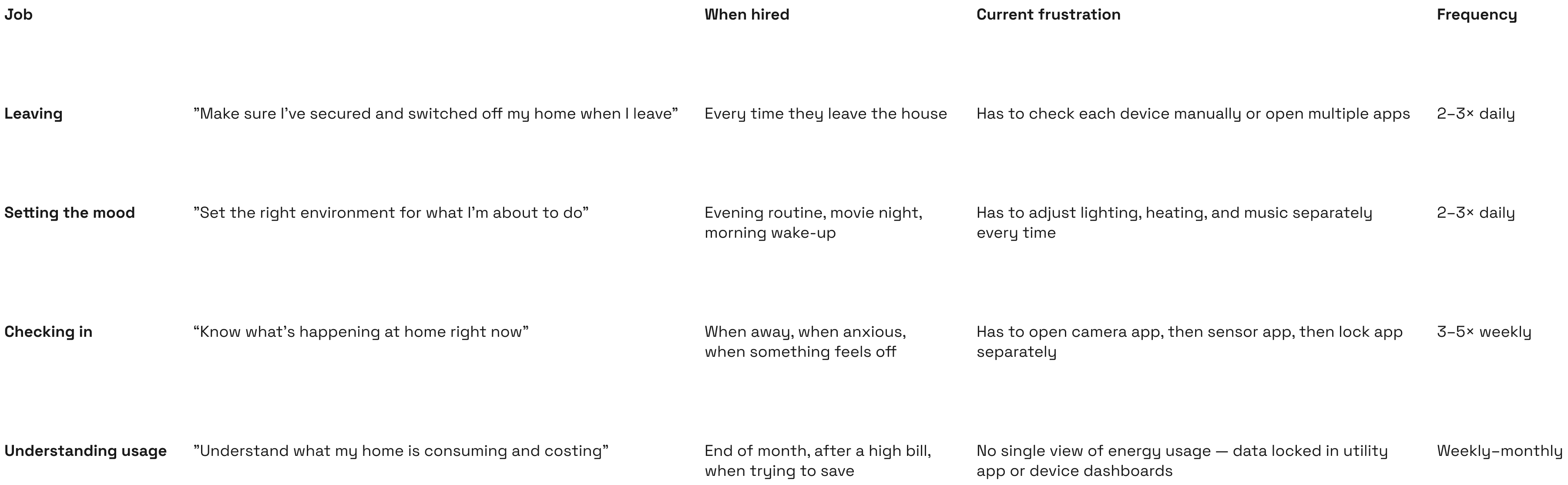
Defining the problem.
Problem statement. How might we design a single home interface where every device — regardless of type or manufacturer — can be seen, controlled, and automated through the lens of how people actually live in their homes?
The reframe.
The brief was "build a device management app." The problem statement became "build a home intelligence layer." That shift — from device-centric to moment-centric — was the most important decision in the project. It changed the IA, the navigation, and the onboarding model entirely.
Design tension.
Simplicity
Homeowners want one tap to control their home. They don't want to navigate a device tree.
Control
Power users want granular per-device settings, schedules, and conditional automations.
Unified UX
Every device type needs to feel like one product — same interaction patterns, same visual language.
Device diversity
A thermostat, a camera, a lock, and a lightbulb have almost nothing in common technically or functionally.
Scope.
In scope: home dashboard, device control, scenes & routines, energy overview, security camera feeds, access control, onboarding & device pairing, design system
Deferred: voice control integration, third-party API connections, multi-property management, billing & subscription flows
Deferring third-party API connections was a deliberate strategic decision made with the client — not a scope cut. Without it, every device type would require bespoke integration work that would have fragmented the UX. The MVP needed to prove the unified model before opening it to external systems.
Design decisions.
Unified IA: one app, one mental model, FIAT + Crypto UX parity, Onboarding & KYC flow, Dashboard as financial OS, Design system.
Twice during the project the client pushed for device-specific UI — custom screens for their premium thermostat brand. Both times I held the universal card model, presenting the scaling argument: a bespoke screen for one device now means 40 bespoke screens by version 2. They agreed both times. The decision was held with evidence, not preference.
Moment-based IA over device-based navigation.
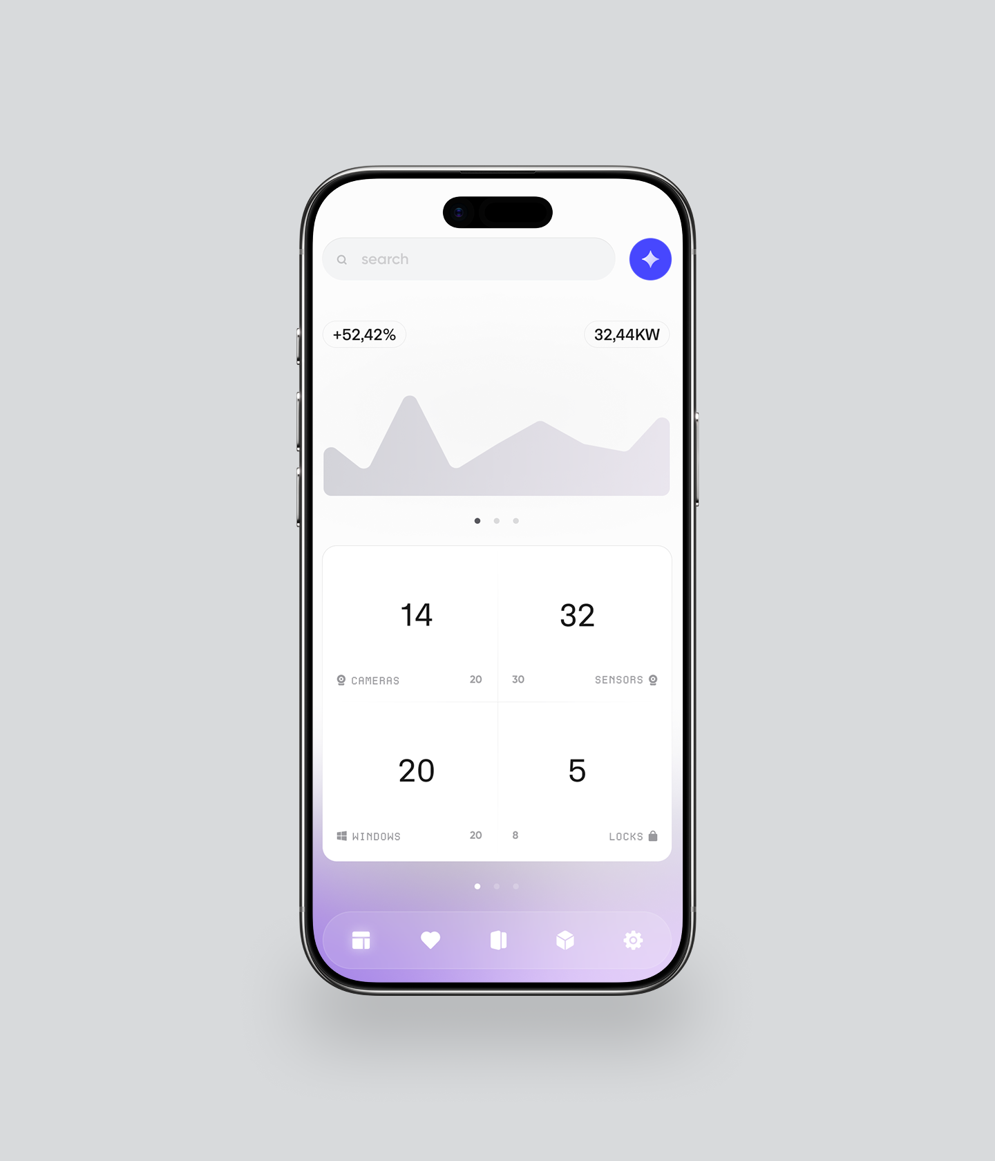
Every competitor organised by device type: lights, heating, security, cameras. We tested this model and it failed — users had to know what type of device controlled a given function before they could use the app. We restructured the IA around four moments: Home (current state), Rooms (spatial control), Scenes (intent-based actions), and Insights (energy + security data). Users navigated by what they wanted to do — not by what device they owned.
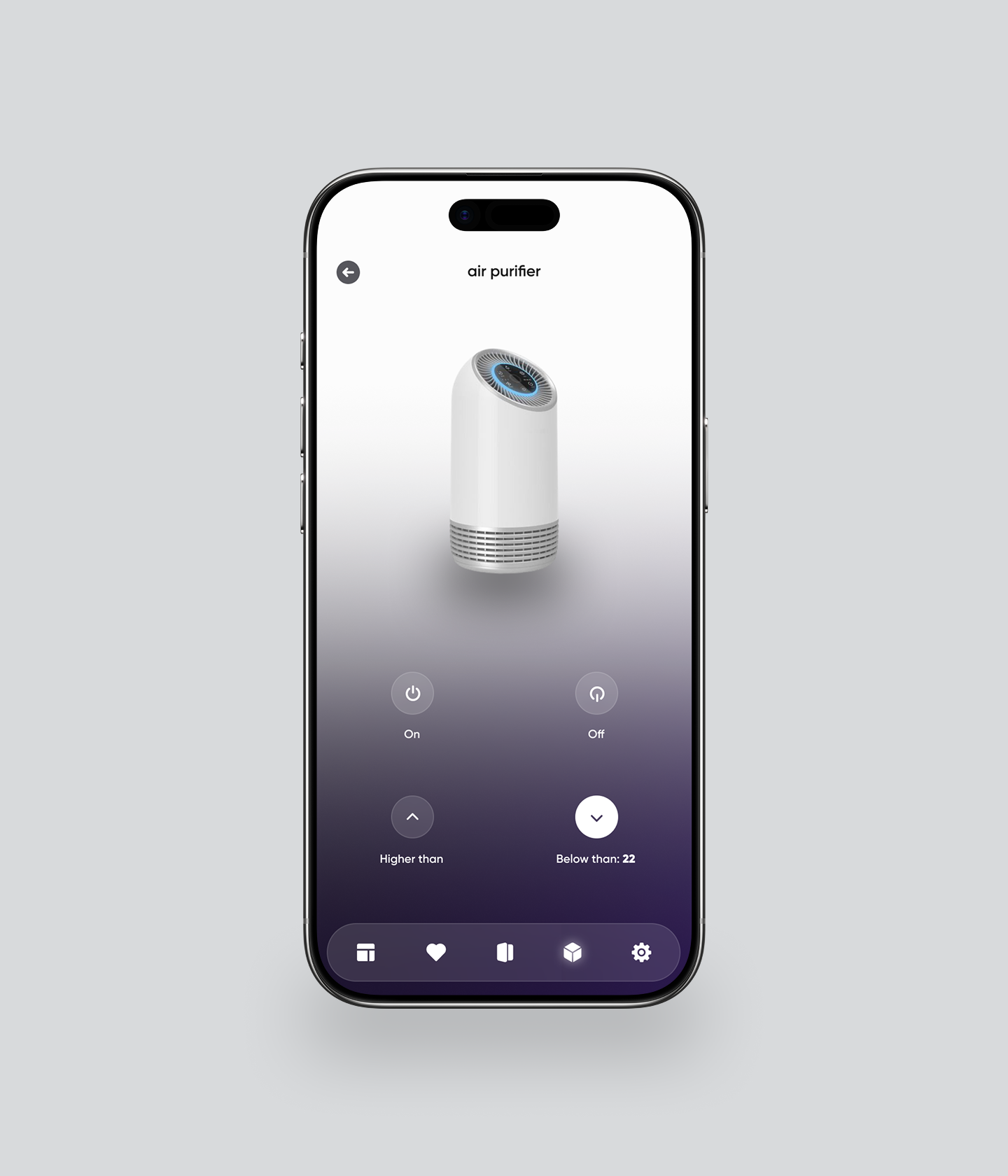
Universal device card component.
The hardest UX challenge: a thermostat and a door lock have nothing in common — different data, different controls, different states. The solution was a universal device card with a fixed anatomy: device icon + name + current state + primary action + secondary controls. The content of each zone changed per device type; the component structure never did. This single decision made the design system viable for engineering.
Rejected approach
Bespoke UI per device type. Faster to design initially, impossible to scale — every new device required a new pattern.
Chosen approach
Universal card anatomy. Slower upfront, infinitely scalable — add any device type by filling in the zones.
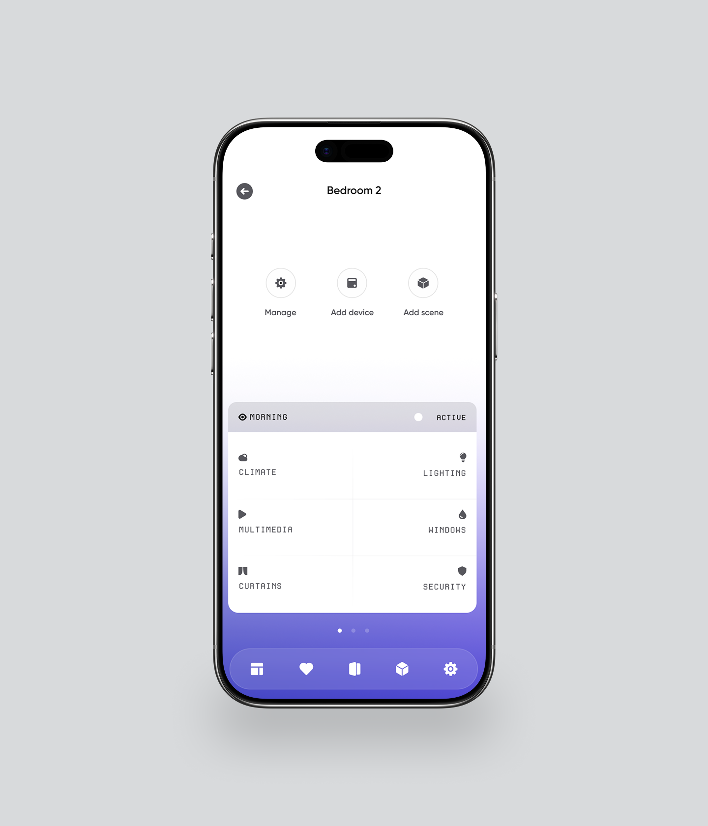
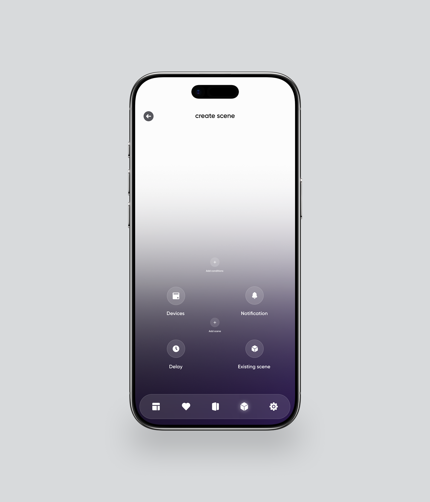
Scenes as the primary automation model.
We tested two automation models: condition-based (if X then Y) and scene-based (named presets like "Morning," "Movie Night," "Away"). Condition-based logic tested as overwhelming for non-technical users — 3 of 4 participants in round 1 couldn't complete an automation setup. Scene-based presets tested as intuitive for all users, with power users able to customise the underlying conditions within a scene. Scenes became the primary entry point; conditions became an advanced option inside scenes.
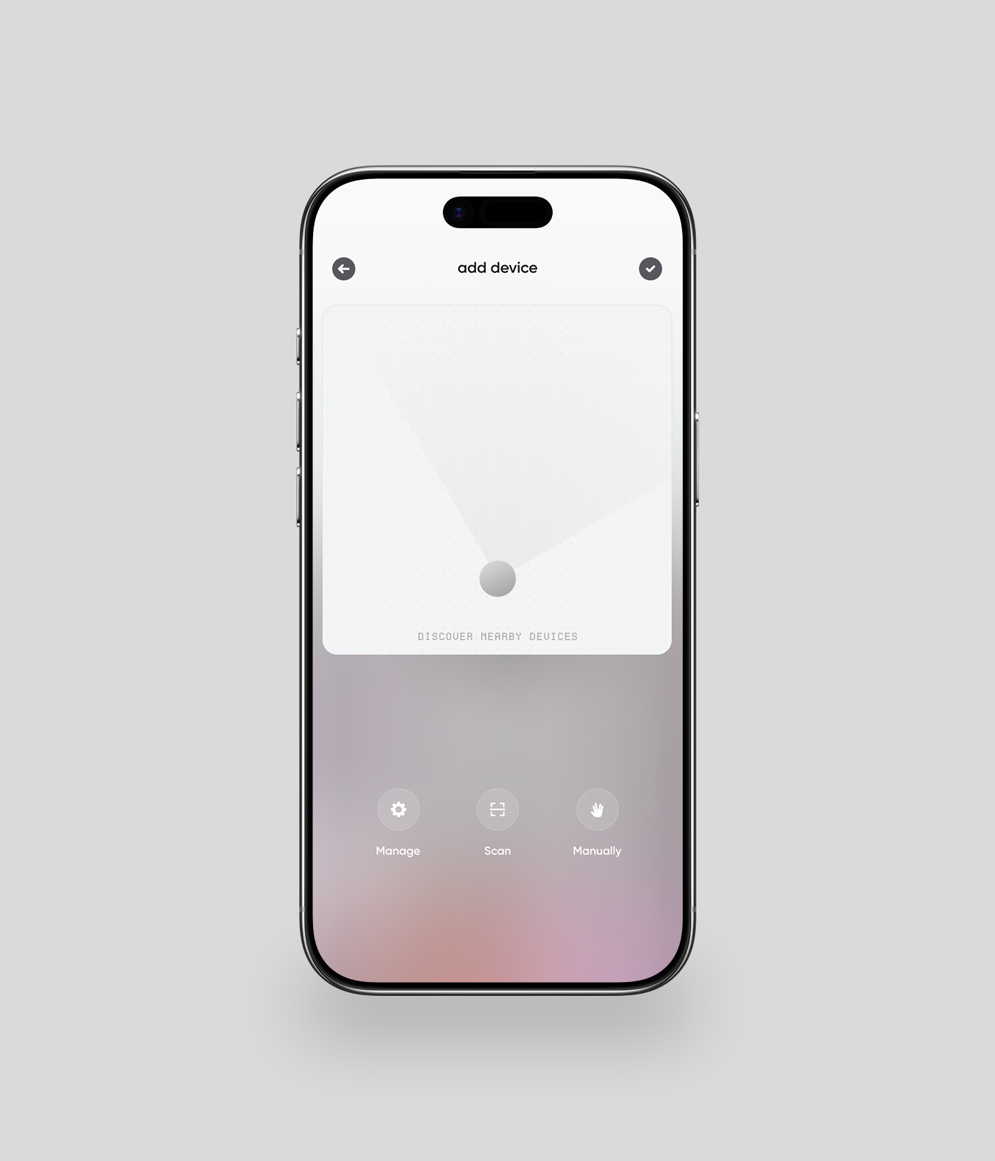
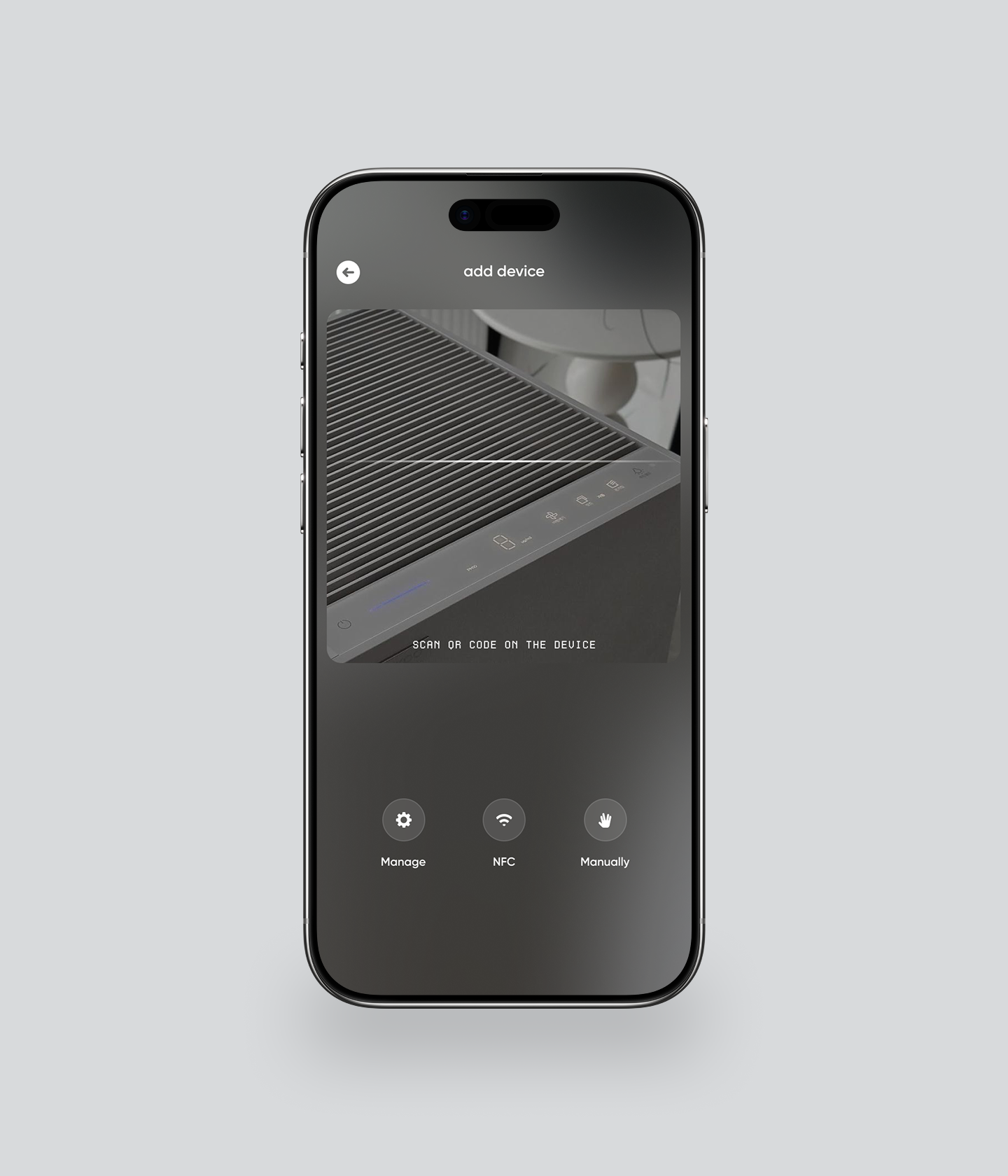
Onboarding: value before pairing.
Device pairing is the highest-friction moment in any IoT product. In our initial prototype, pairing was the first thing users encountered — and 60% of test participants abandoned or needed help. We restructured onboarding to show the home dashboard with placeholder devices first, making the product's promise tangible before asking users to scan QR codes and configure Wi-Fi networks. Pairing became step 3, not step 1. Perceived friction dropped significantly.
Design system as the enterprise deliverable.
The enterprise client's primary goal was a baseline to build on. That meant the design system wasn't a side deliverable — it was the product. We built a token-based system with a universal device card, four layout templates (dashboard, room view, device detail, automation builder), and full state coverage for every component: default, active, offline, error, loading. Engineers could add new device types without returning to design.
Testing and itearation.
2 rounds, 8 participants, 5 design changes
Lo-fi
Key finding
Device pairing as step 1 caused 60% abandonment. Users didn't understand why they needed to pair devices before seeing what the app did.
Change made
Moved pairing to step 3. Dashboard with placeholder state shown first. Users reported feeling "in control" before pairing a single device.
Key finding
Condition-based automations ("if temperature > 22°C then turn on fan") were described as "complicated" and "not for me" by 3 of 4 participants.
Change made
Replaced conditions with named scenes as primary model. Conditions moved to advanced settings within scenes. All 4 participants completed automation setup in round 2.
Lo-fi.
Key finding
Device pairing as step 1 caused 60% abandonment. Users didn't understand why they needed to pair devices before seeing what the app did.
Change made
Moved pairing to step 3. Dashboard with placeholder state shown first. Users reported feeling "in control" before pairing a single device.
Key finding
Condition-based automations ("if temperature > 22°C then turn on fan") were described as "complicated" and "not for me" by 3 of 4 participants.
Change made
Replaced conditions with named scenes as primary model. Conditions moved to advanced settings within scenes. All 4 participants completed automation setup in round 2.
High-fi.
Key finding
The "Insights" tab (energy + security data) was described as "interesting but I don't know what to do with this." Data without action felt passive.
Change made
Added contextual recommendations to the Insights screen: "Your heating ran 3 hours longer than usual yesterday — adjust your Away schedule?" Data became actionable, not decorative.
Decision held under pressure.
After round 1, the client requested a prominent "Manufacturer" filter on the home dashboard — a legacy request from their hardware partners. Testing showed users never filtered by manufacturer; they filtered by room and function. I presented the test data directly in the stakeholder review and recommended removing the filter from the primary UI. It moved to device settings. The client agreed.
Outcomes & impact.
What the project delivered beyond the screens.
Stakeholder impact.
The MVP was presented to enterprise stakeholders and property investors. The reception was strong enough that the client immediately commissioned a scope expansion — adding multi-property management and a B2B dashboard for facilities teams. That expansion wouldn't have happened if the MVP hadn't convinced stakeholders the unified model was viable at scale.
Design system value.
The universal device card and four layout templates gave engineering a foundation to add new device types without design involvement. The client's development team estimated the system would reduce design-to-build time by roughly 40% for each subsequent device integration — the baseline held.
Proxy metrics — what we designed for.
Device pairing completion rate — designed to be measurable from first launch via onboarding analytics
Scene activation frequency — the primary engagement signal for the automation model
Session depth — number of tabs visited per session, indicating whether users were exploring beyond device control
Time-to-first-automation — the core activation metric for the product's core value proposition
Get in touch
— ivan@stoilovskikh.com